Horsehill Vineyards
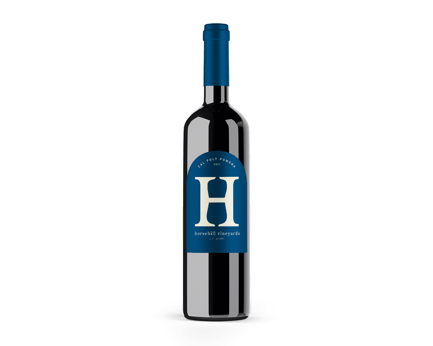
Working with the vineyard on campus, a label was designed for the award winning Zinfandel Red and Zinfandel Rosé. Elements from the school’s campus and branding were implemented to tie meaning to the wine label and the vineyard’s roots.

final label
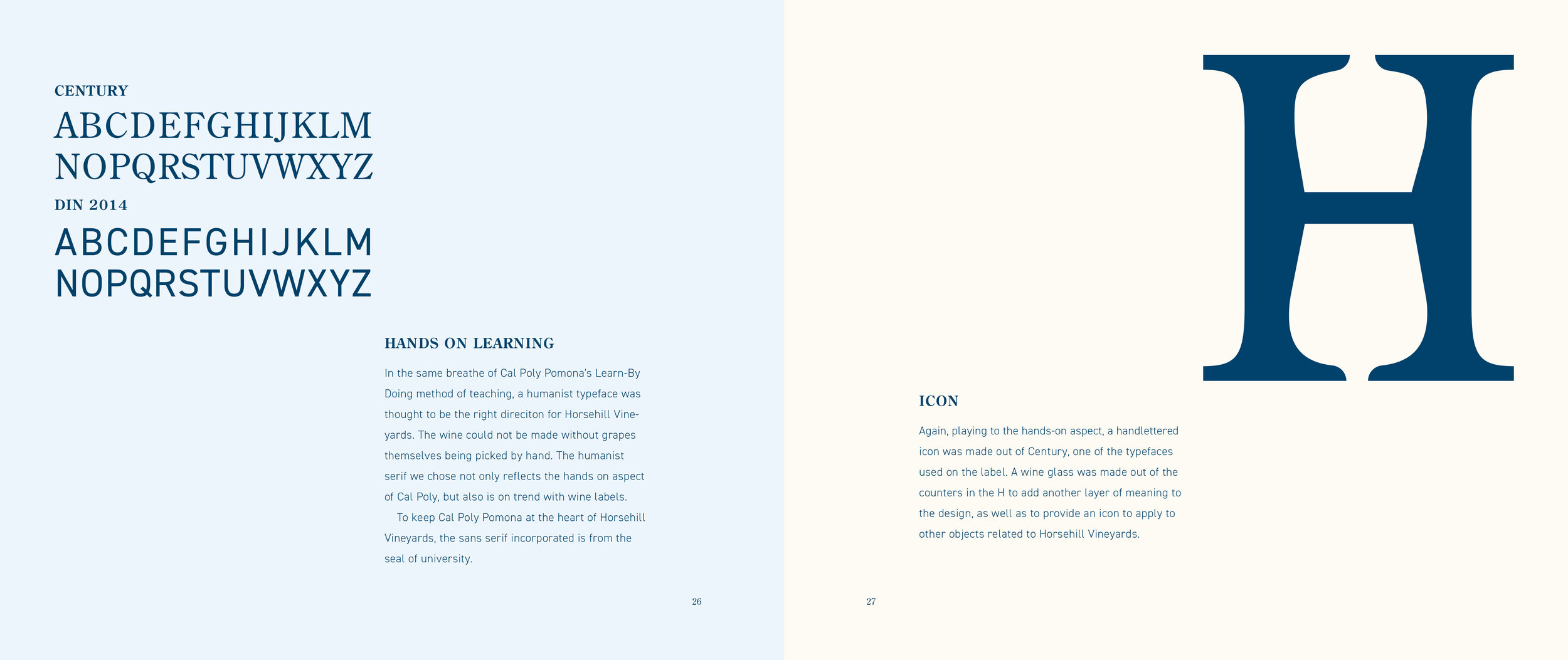
The wine labels were kept very similar between the red and the rosé. Rosé bottles typically have lighter labels, which is why the cream and gold was chosen for that one, while the red was assigned the dark blue and cream colors. The shape of the label is inspired by the arches at the iconic horse stables on campus. The logo of the large H has 2 wine glasses in the open bowl of the letter. This was designed with the intention to provide the vineyard with a simple icon for their branding.
color palette
The color palette for the wine labels was inspired from the school’s color scheme, but slightly modified. Instead of white, a cream was used to slightly lighten the contrast and elevate the design. The blue was made slightly a darker shade. For the rosé, a more brown-gold was chosen instead of a bright yellow to create a more elegant label.

typography
The typefaces chosen for the wine label were chosen very intentionally. Due to the hands on nature of polytechnic learning and the hands on labor of taking care of a vineyard, a humanistic serif, Century, was chosen for the name of the vineyard. The sans serif, DIN Condensed 2014, was chosen to compliment the serif and is also found on the university’s seal.

process book
When presenting to the client, they were shown the design solutions in the form of this process book.