milk & cookies
Milk & Cookies has established itself as a creative, high quality dessert store in Southern California, and beginning to expand their goods into nationwide retail stores.
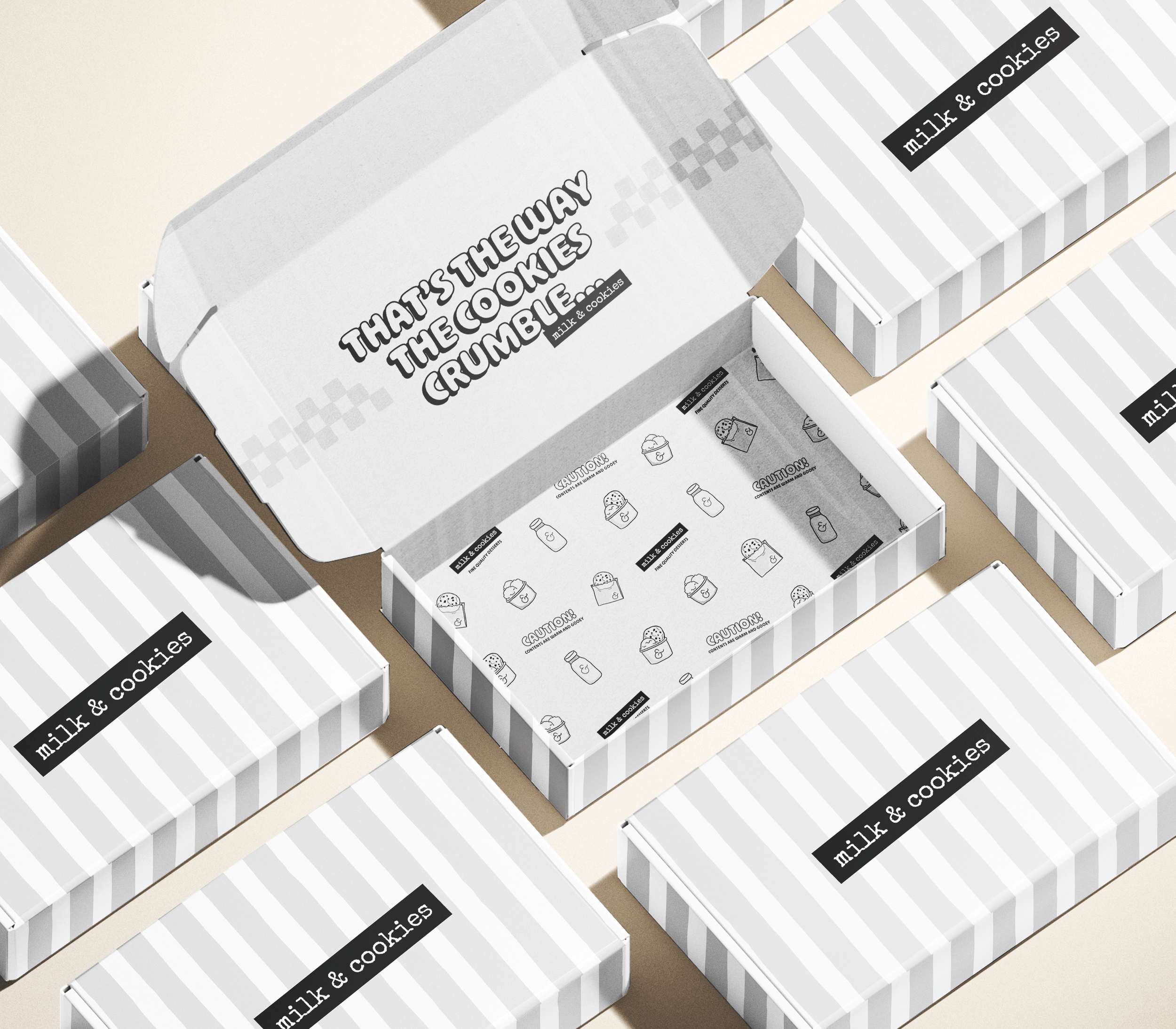
Milk & Cookies approached me to refresh their style guide to prepare for a new packaging launch coming later this summer. They wanted a new typeface, secondary logo, new icons/illustrations, and packaging designs.
PROJECT DESCRIPTION
DESIGNER
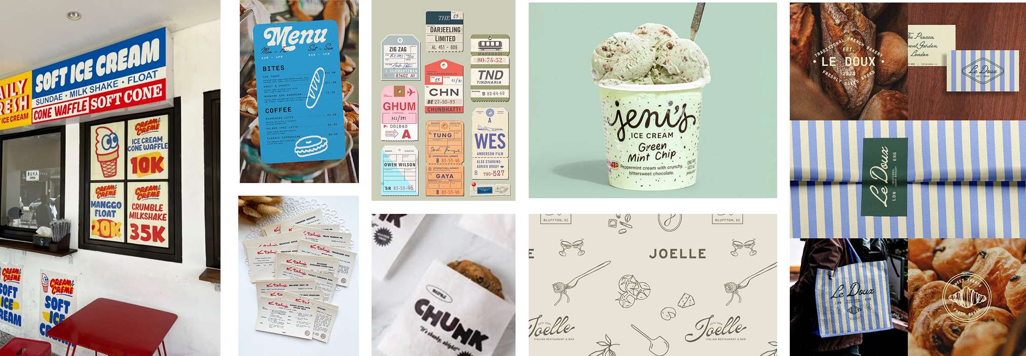
COMPETITOR ANALYSIS & MOODBOARDING
Business model of In-N-Out —> high quality goods for low prices
Visual style of Pressed Juicery —> black and white, neutrals to allow ingredients/products to stand out
Crumbl —> artificial, fake, big box corporate vibe are all negatives we want to stay away from
Focusing on clean, organic, and handmade goods with a vintage twist
Keep typewriter font and black & white as main color palette
KEY TAKEAWAYS
LOGOS
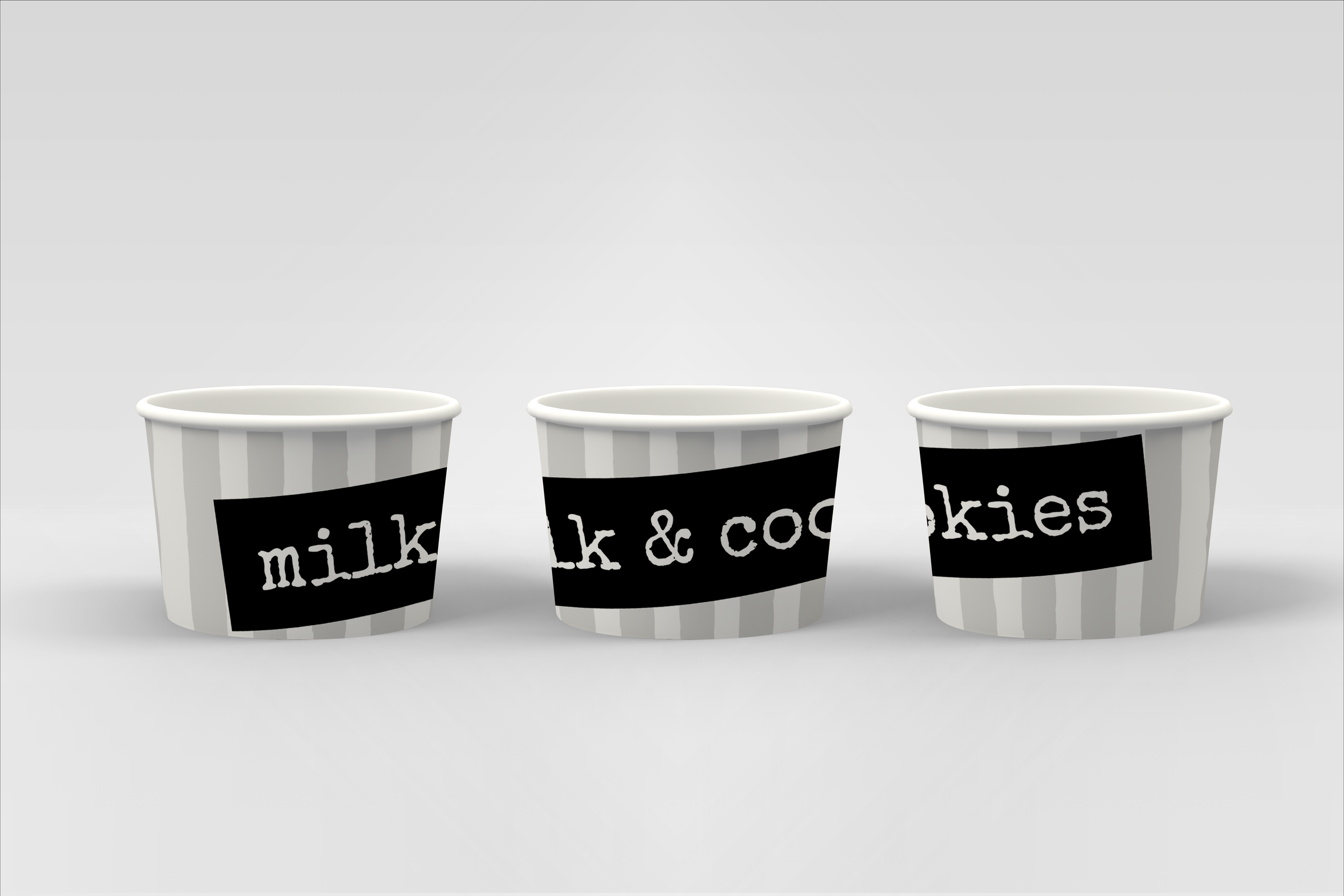
By adding a holding device to the primary logo, selecting a cleaner typewriter style typeface, and removing the circle from the ampersand, we achieved the new main logo.
These changes provide context for the typewriter font, giving the appearance of a vintage label maker. The new typeface allows for better legibility. Removing the circle allows for better scalability of the entire logo.
Minimal changes created a modern feel while maintaining brand ethos.
ORIGINAL LOGO
NEW LOGO
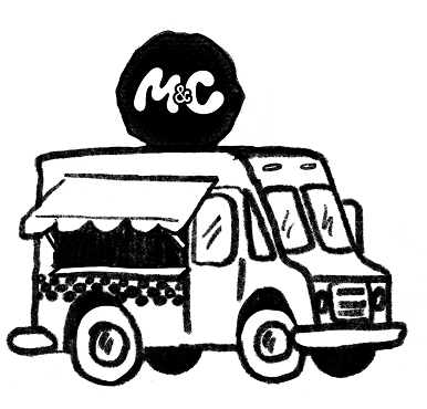
SECONDARY LOGOS
TYPOGRAPHY
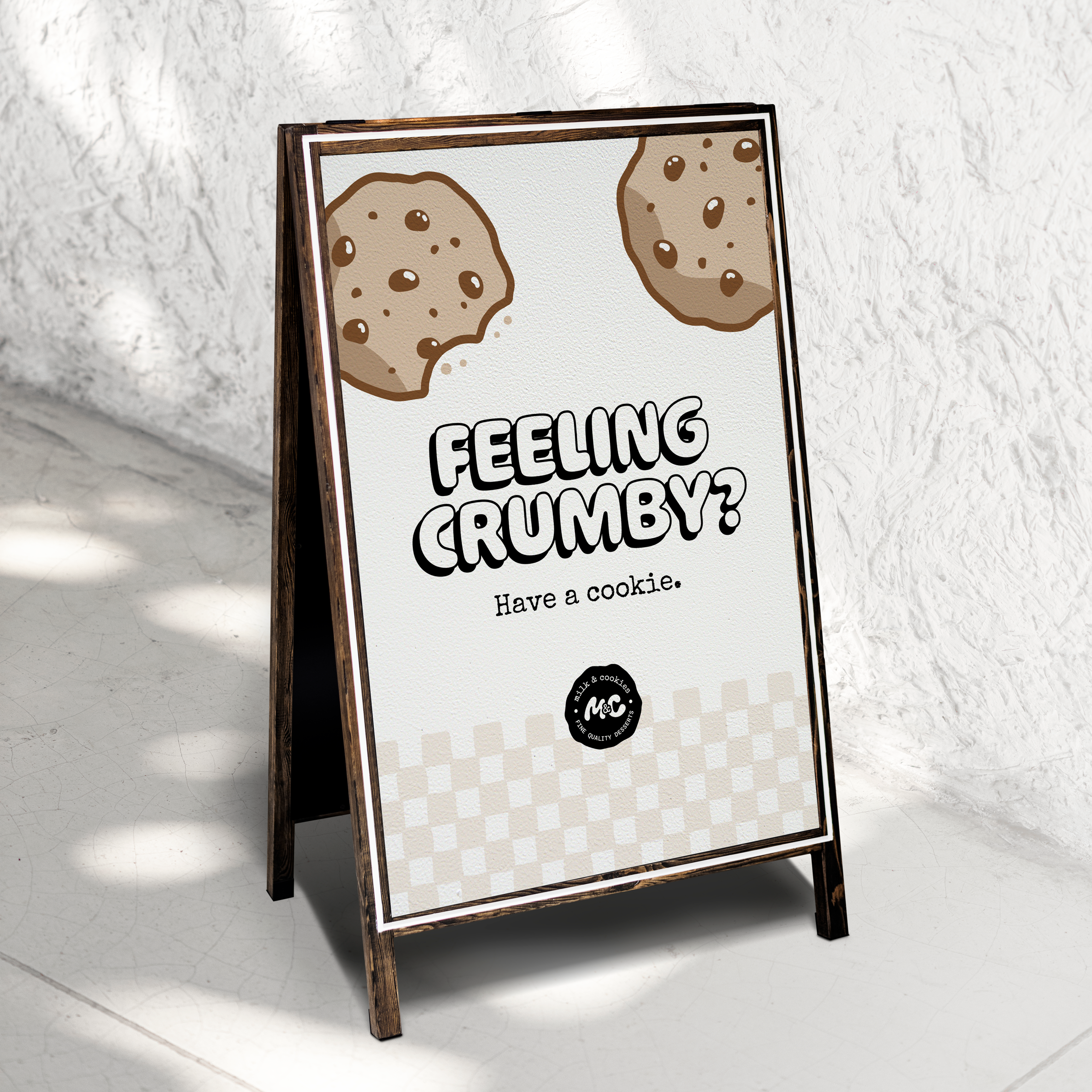
A bold, bubbly typeface that captures the whimsical, indulgent spirit of Milk & Cookies.
A vintage-inspired typewriter typeface that brings a sense of nostalgia, character, and handcrafted charm.
A clean, modern monospaced typeface that brings balance and clarity.
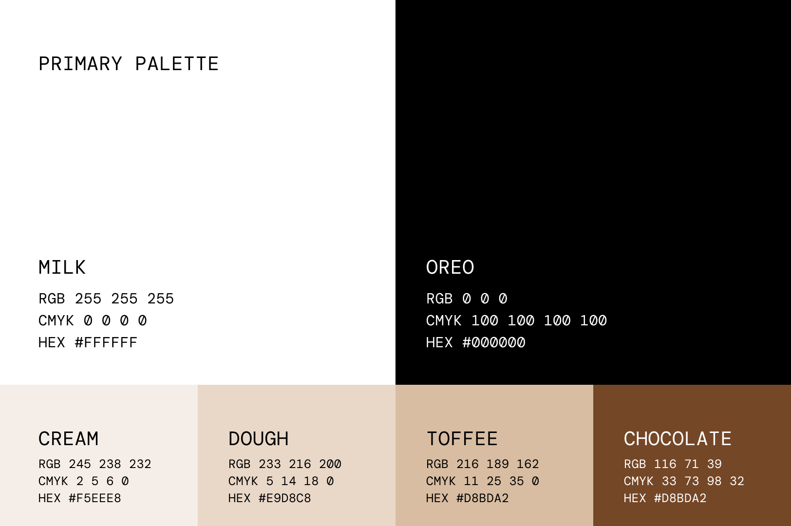
COLOR
Color elicits a strong emotional response, but is often one of the strongest visual communicators available to us.
When this project began, it was clear that color was not up for debate. They will remain black and white, featuring some Kraft paper and wood tones throughout brick and mortar stores.
Throughout the process of building the style guide, I was able to show examples of how colors are great visual communicators, especially for packaging where products won’t be visible.
The expansive secondary palette is to accommodate monochromatic palettes for different flavors or ingredient features of the desserts.


