Binty’s
This project is a case study for a coffee shop inspired by my dad, Binty. The goal was to create a classic yet modern logo for a cafe. To honor our family’s roots, the shop was designed using elements from Scandinavia and South Side Chicago.

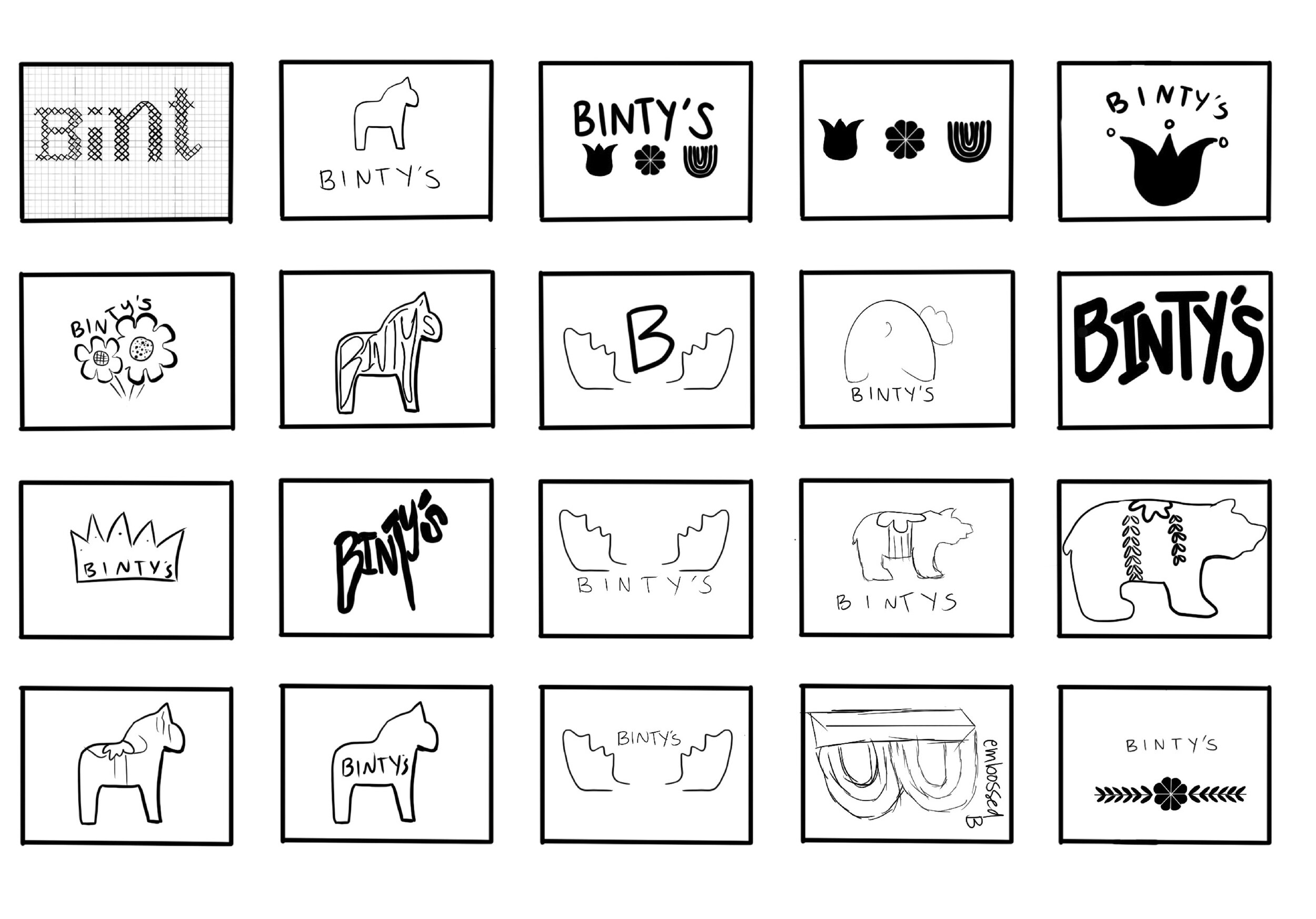
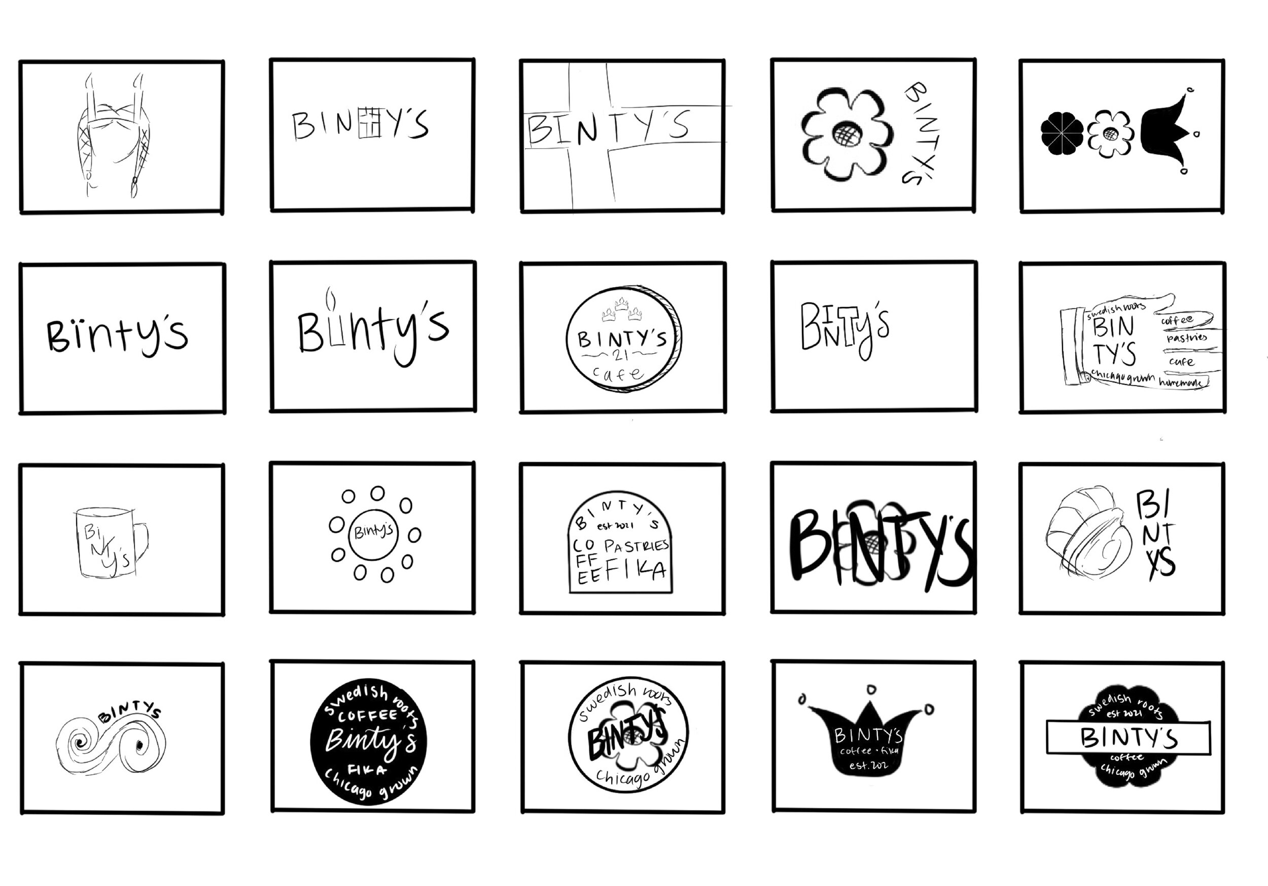
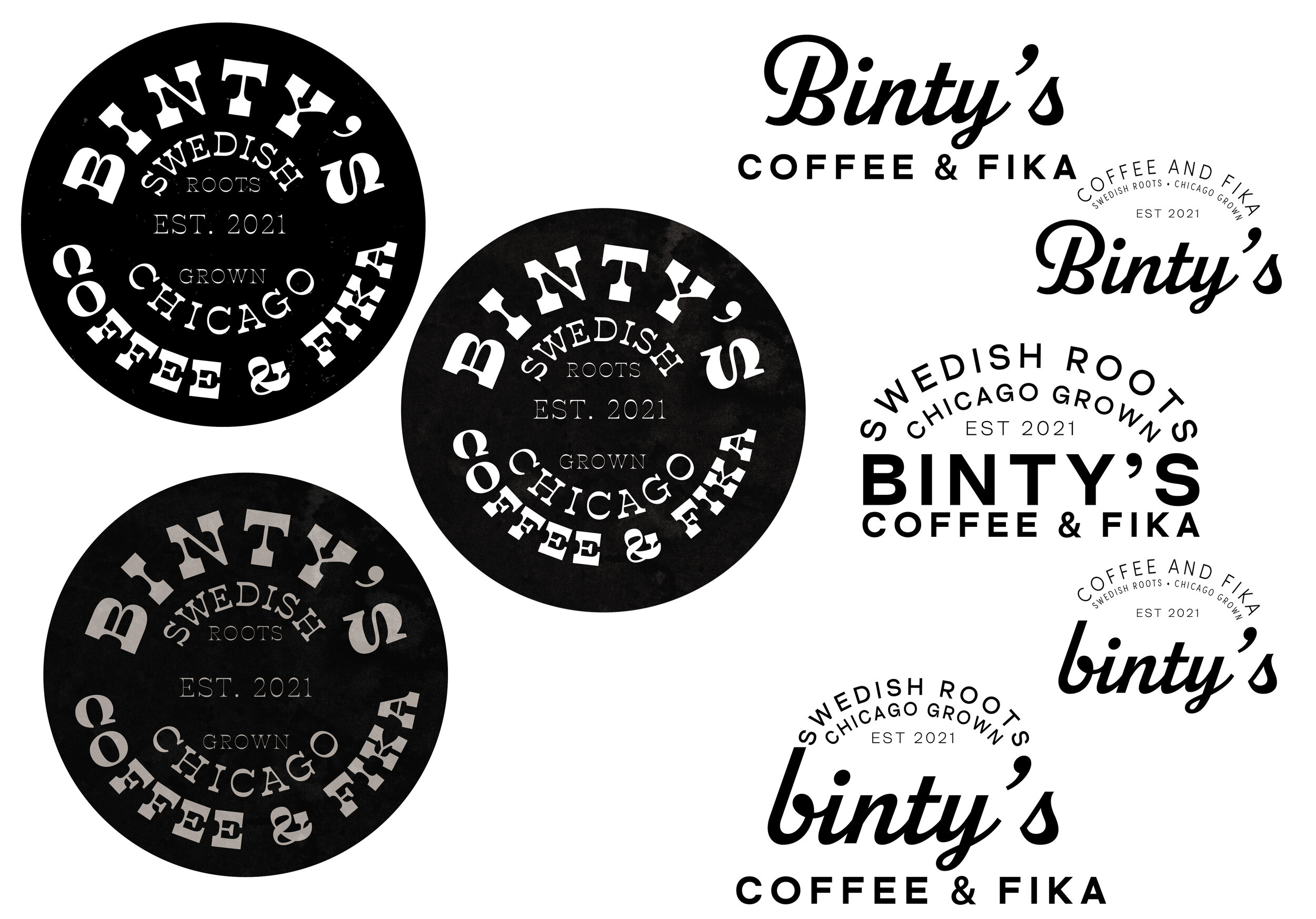
logo thumbnails
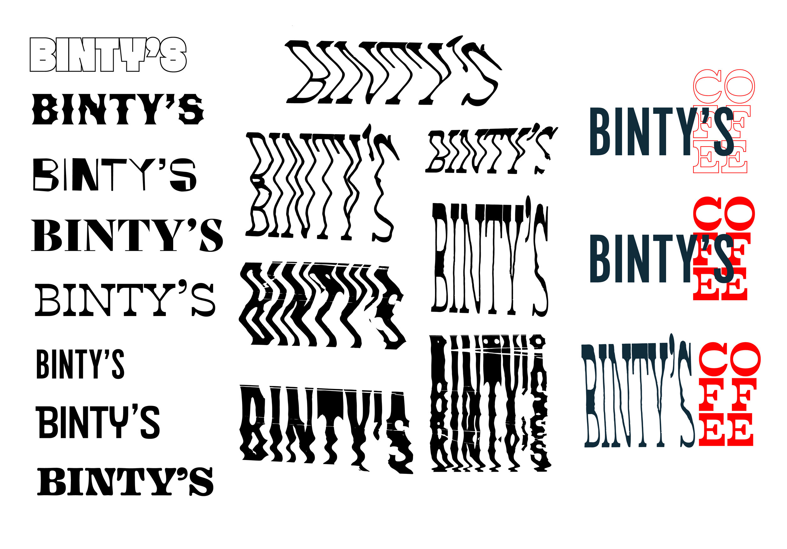
The logo design process always begins with brainstorming. These thumbnails were the initial thoughts on what directions to take the Binty’s logo in while keeping the theme of Swedish and Chicago heritage in mind.
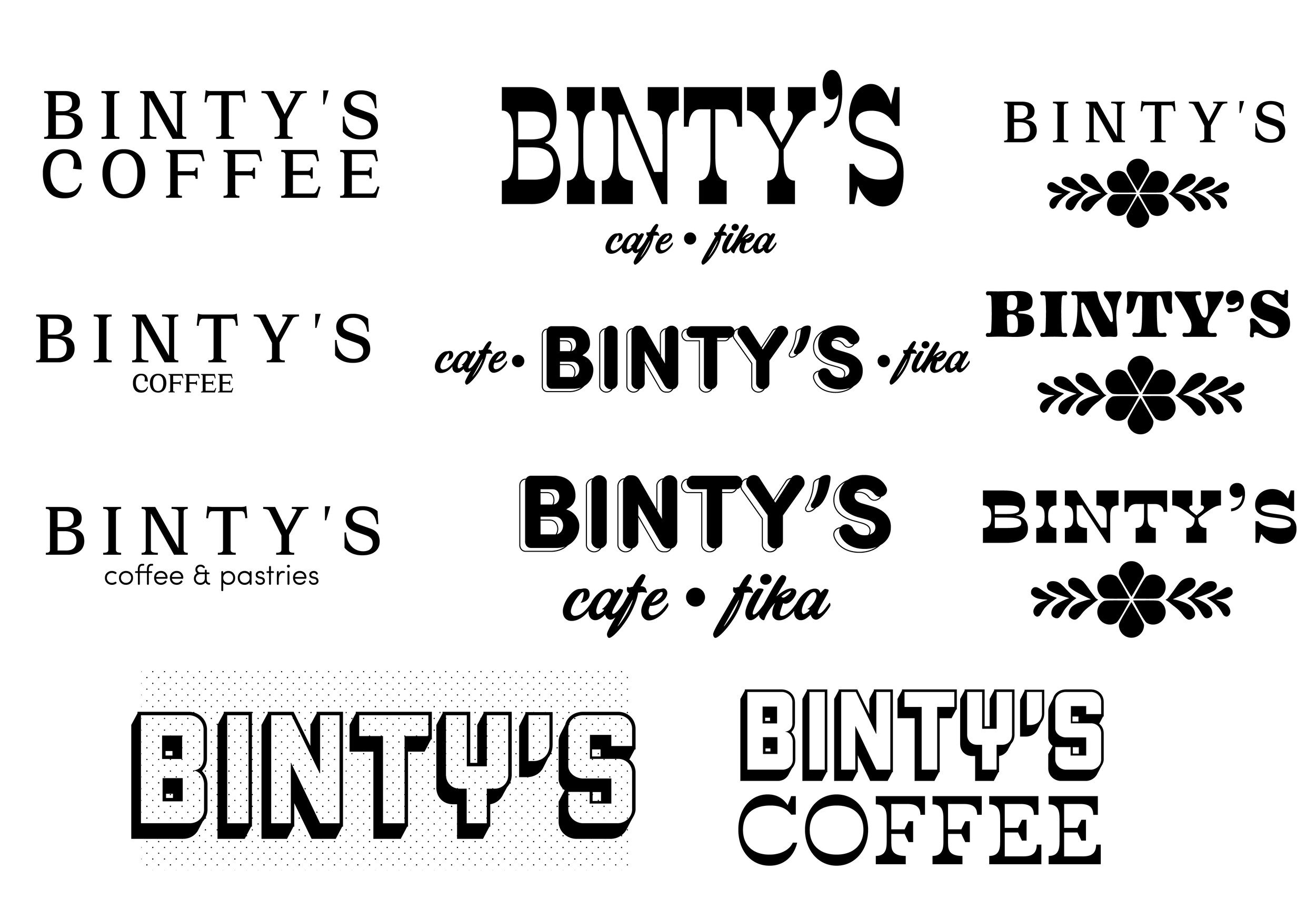
final logo
This logo was chosen along with two secondary logos. The dala horse is an iconic staple of Swedish heritage and Swedish folk art. The bear was replaced for the horse because of the symbolism of a bear on Chicago sports teams as well as the state flag of California. The logo on the left is the primary logo while the logos on the left can serve as secondary logos. There are two secondary logos so there is flexibility for when text is all you need or when only imagery is necessary.

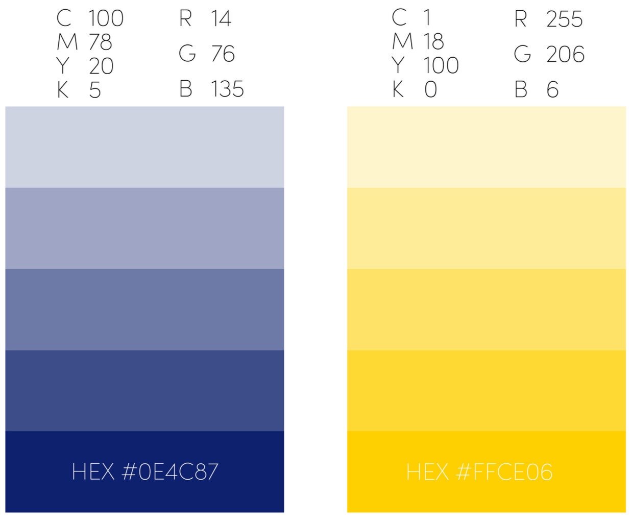
color palette
The colors chosen were inspired by the Swedish flag, but are slightly different. The blue is a bit darker to provide more contrast within the brand identity.
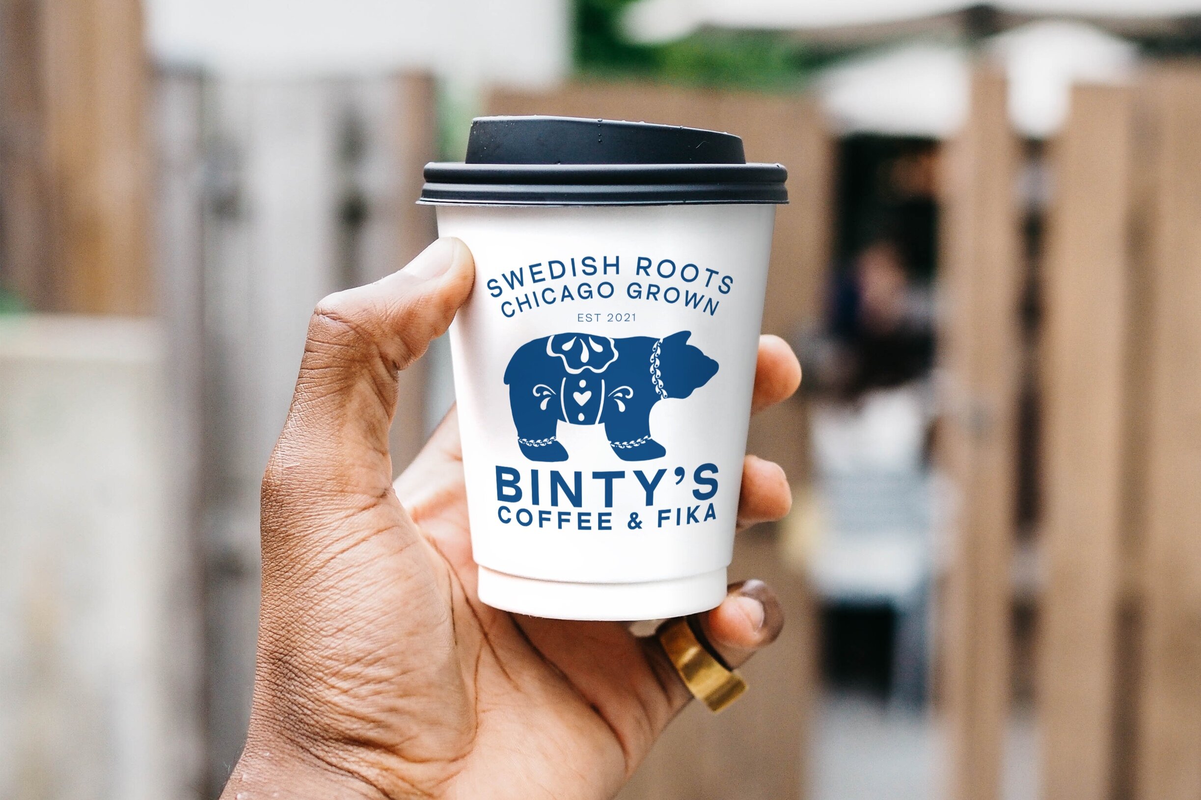
collateral
Here are some mock ups of some merchandise that could be sold or used around the cafe.


environmental graphics
These are the production notes provided for how the flagship store of Binty’s should be designed.


